Intro
About a year ago, I came across a problem solving framework for solving JavaScript coding challenges. It's pronounced oy - chee and uses the letters O.I.C.E. to help remember the framework by using an acronym.
Traditionally, the framework's acronym stands for the following:
- O: outcome
- I: input
- C: conditions/concerns/complexities
- E: examples/edge cases
I've found that with some tweaking, the framework can be useful in other areas beyond solving coding challenges.
For example, when moderating a session on a topic, it has proven to be a useful way to:
- 1) keep the conversation on track
- 2) summarize what's already been said (helping to avoid circular conversations)
- 3) find/maintain focus on the desired outcome
info
For more information on the O.I.C.E. framework, check out the Medium.com article What’s OICE? Oh that’s niceee… A Setup Framework to Technical Interviews and White Boarding
Project Planning
Outcome
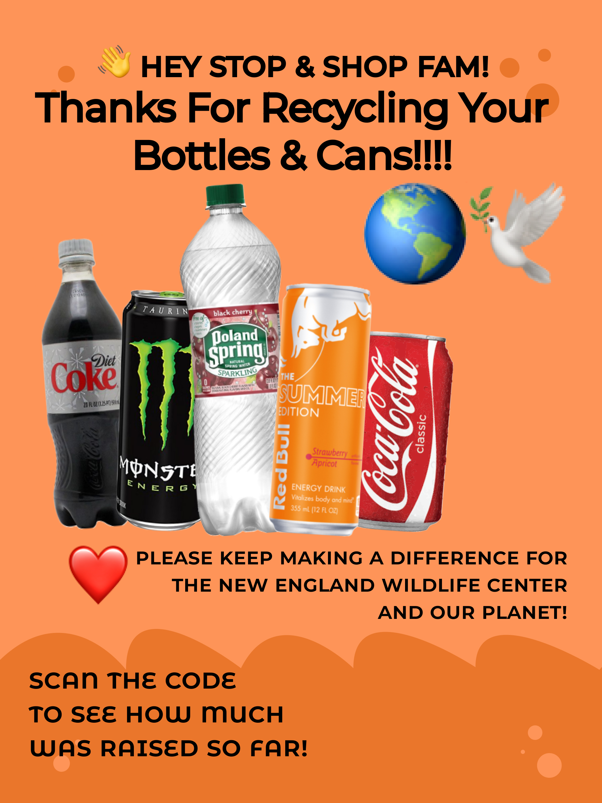
Print flyer that:
- Thanks employees for participating
- Presents qr code link to web application
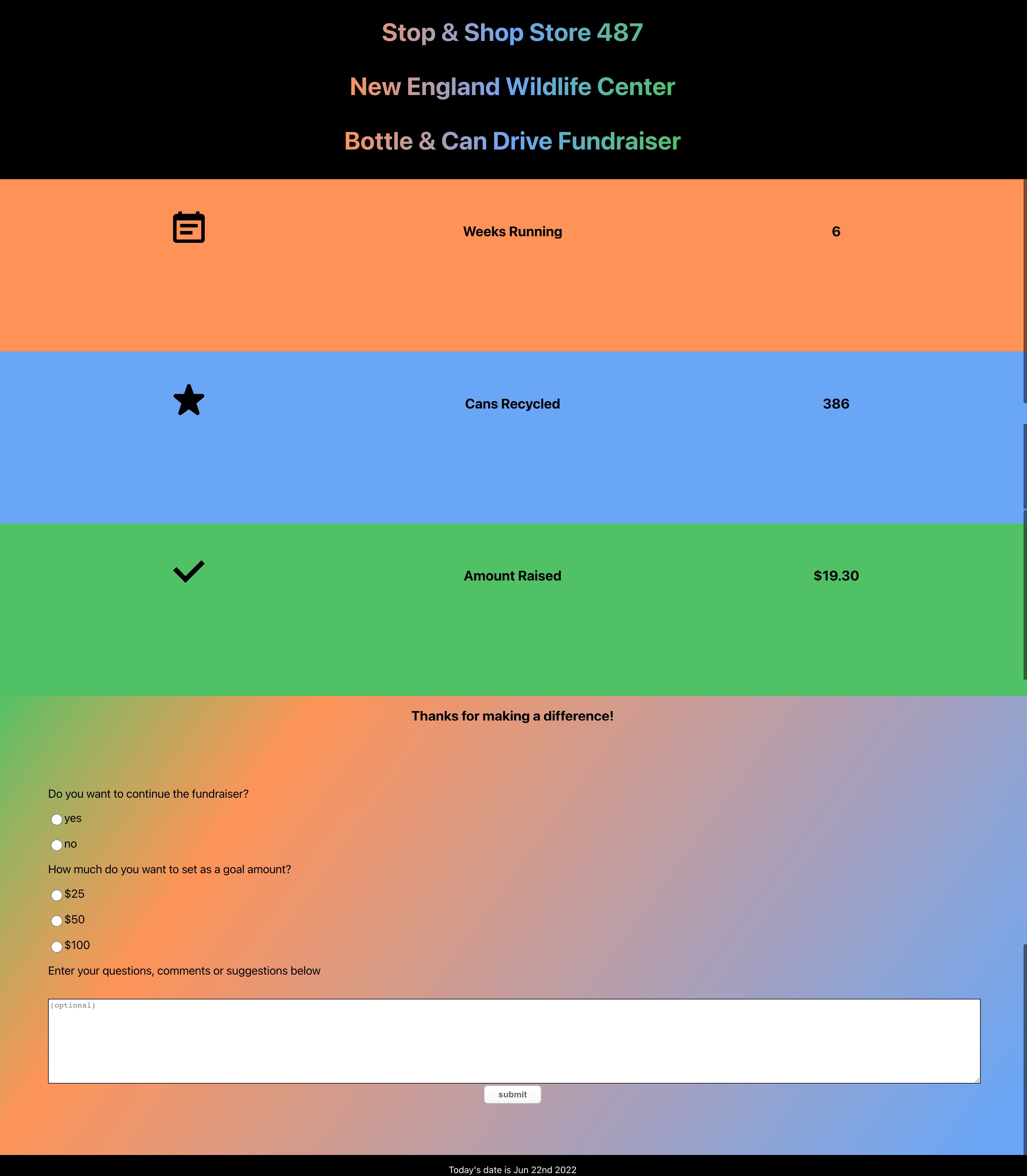
Web application that:
- Provides update on fundraiser
- Presents survey asking for input on next actions & suggestions
Inputs:
- Designed & printed flyer
- QR code linking flyer to application
- Info on what the funds are going towards
- Info on how many items have been recycled
- Info on how much has been raised so far
- Form with:
- radio inputs allowing users to vote to continue the fundraiser
- radio inputs allowing users to vote for a goal amount
- textarea to share comments, questions, and suggestions
- submit button to handle form processing
Concerns/Conditions:
UX/UI should:
- Thank users for participation
- Reiterate the purpose of the fundraiser
- Be accessible to employees only
- Display the qr code large enough to be scanned easily
Examples/EcoSystem/Tooling:
Content
Technical Tools
- Figma
- EPS to SVG Converter
- Remove the background from images for free
- Create React App
- CSS Gradient Text Generator
- CSS Gradient Background Generator
- Chakra UI
- How to format dates in ReactJS
- QR Code & Barcode Scanner
- GitHub: code hosting platform for version control and collaboration
- Vercel: platform for frontend frameworks and static sites
Project Development Log
Creating the UX & UI
- Met with reresentative stakeholders to discuss desired project outcomes and completion dates
- Designed the flyer in Figma using a community template with recommended print flyer dimensions (2100 x 2800)
- Then for the web application, created a basic UI prototype in Figma
- Next, created a new React Application
npx create-react-app bottle-drive-fundraiser - Manually installed ChakraUI
- With NPM
npm i @chakra-ui/react @emotion/react@^11 @emotion/styled@^11 framer-motion@^6 - Set up the
ChakraProviderat the root of the application inindex.js- Imported
ChakraProvidercomponent
- Imported
- Wrapped
ChakraProviderat the root of the app
- Wrapped
- Installed Chakra UI icons
npm i @chakra-ui/icons- imported selected icons in
App.js - Used the
boxSizeprop to change the icon sizes
- Created a React component for the form,
Form.js- For backend form processing and integration with third-party services (in this case, slack), installed formspree with command
npm install @formspree/react - added import statement,
import { useForm } from '@formspree/react';toForm.js - using React useForm hook and event listeners to handle the change in form data's state.
- Imported
Form.jsto the top ofApp.js
- For backend form processing and integration with third-party services (in this case, slack), installed formspree with command
- Created and imported
form.cssto access styles for form Installed Chakra UI Buttonsnpm i @chakra-ui/button
- Added current date to application with Moment Library
npm install --save momentpackage info - Uploaded to GitHub Repo
- Deployed web application to Vercel for hosting
- Created qr code linking to web application with the QR Code & Barcode Scanner app on iphone.
- Added qr code to flyer
- With NPM
Print Flyer Design minus QR Code

Web Application Screenshot

Conclusion
As is, the deployment functions as expected, but there is more to be done. Will be following up this post with a documentation post on testing the web application for user accessibilty.